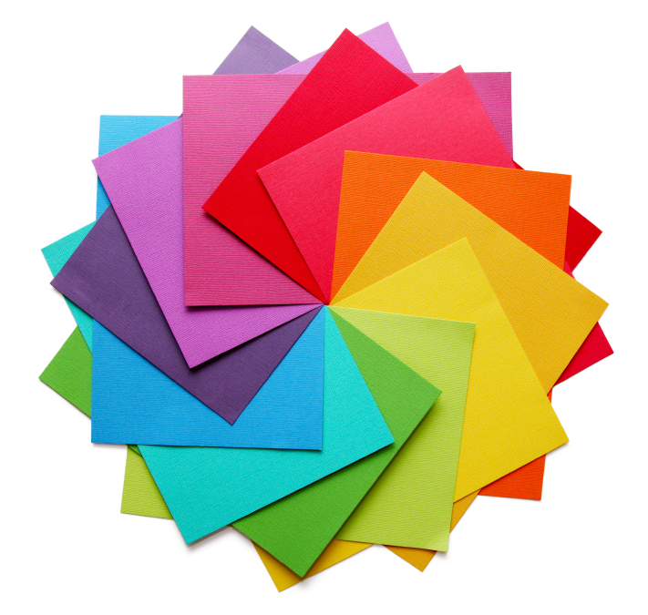
When you’re designing your perfect leaflet, there are plenty of design elements to think about, from your branding to the images you use, to the font you write in. But, one of the most important design elements has to be the colours you choose. So, what colours will help you achieve leaflet distribution success?
Firstly, when you come to your leaflet design, a good place to start is with big companies in your industry. Think about which colours they are using as there is probably a good reason they chose them.
Red
Red is often used in the fast food industry, most notably used by the biggest chains – McDonald’s, Burger King and KFC. We associate red with excitement and energy, so the fast food industry often uses the colour to stimulate these emotions in their customers. Plus, it’s bold and bright, so it’s great for grabbing attention!
Yellow
While yellow is often used in branding, especially in the food industry (think of McDonald’s golden arches!), it can be a tough colour to work with in print. Yellow is often not easy to read, but if you use it sparingly, it can help to brighten up a leaflet, especially if it is already part of your branding.
Blue
Blue is another incredibly popular colour for branding, particularly in the technology industry. This colour is used by a huge number of tech companies such as Facebook, Samsung, Twitter and HP. Blue is a traditionally calming colour and can evoke a sense of trust. It can be a popular colour for leaflet design as it is calm enough to be used in large blocks without looking garish.
 Green
Green
Green is a popular colour in a range of different industries, from fashion (Lacoste) to drinks (Carlsberg and Heineken) to agriculture (John Deere), and even to leaflet distribution – The Private Postman! This is a similar colour to blue as it can have a calming effect, making it a great colour for some brands. This is another colour that translates well to print and can be bold enough to grab attention without looking too cartoonish.
Black
This may not seem like the most obvious colour choice for leaflet design, but black can be used to achieve a sleek and sophisticated look. Many high-end companies use black in their branding, such as car companies like Honda and Mercedes- Benz and fashion brands such as Chanel and Burberry. When used in print, black can be great for giving a clear message that is stylish and sleek.
White
Just like black, white is often used to give a sense of sophistication and can look particularly elegant and high-end when used well. It’s important to use white space in leaflet design in order to break up blocks and to ensure that it doesn’t have the appearance of being too busy. However, white doesn’t just have to be used as blank space but can be incorporated into the design.
It’s important to consider the colours you will use in your design when creating your leaflet, and we are here to help you get the perfect mix. If you would like to inquire about our leaflet design and print service, please don’t hesitate to get in touch with a member of our team who will be more than happy to discuss your requirements with you. Give us a call on 0203 269 1012 or drop us an email at info@theprivatepostman.com and we will help you further.

